
Redefining motherhood:
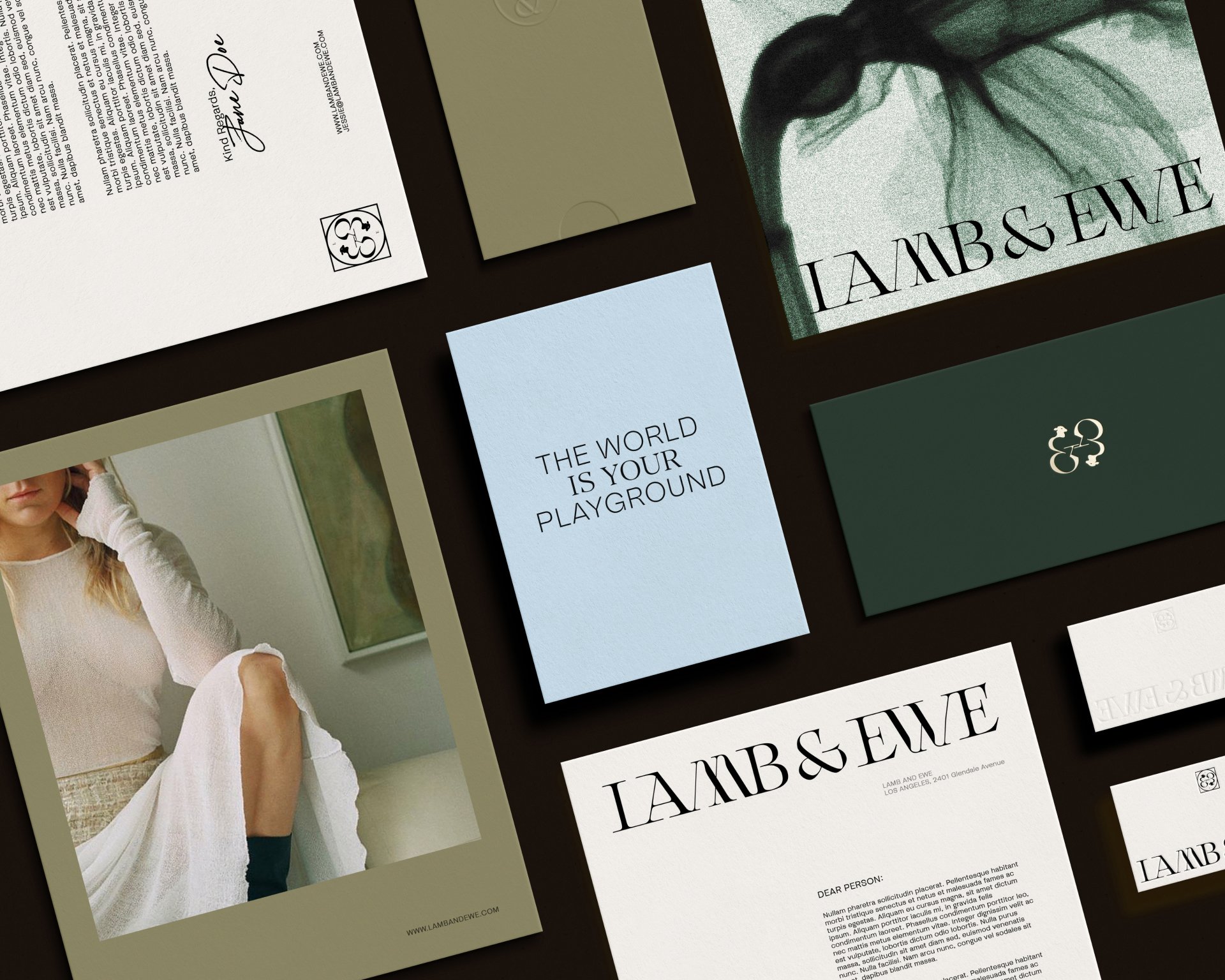
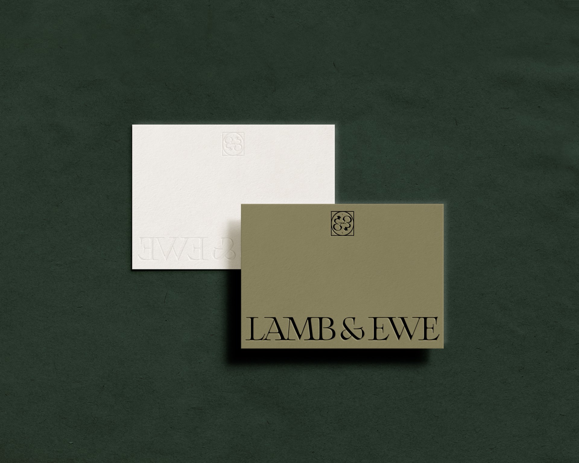
Brand Identity for Lamb & Ewe
Lamb & Ewe is a brand that specializes in creating nursing bras for powerful women. The company's mission is to provide comfortable and stylish nursing bras that empower and instill confidence in mothers. The target audience of Lamb & Ewe includes both new and experienced moms who value aesthetics while also seeking practicality in their clothing choices.

Mariam was tasked with developing a brand strategy that would specifically appeal to the target audience of Lamb & Ewe. Her strategy involved creating a logo and color palette that would effectively communicate the brand's core values and resonate with the audience


The logo designed by Mariam features two intertwined lambs, symbolizing synchronicity, cycle, and power, akin to the king and queen on playing cards. This imagery exemplifies the strong bond between mother and child, capturing the essence of motherhood.
The addition of the ampersand in the logo further emphasizes the brand's focus on connection and unity. The use of lambs as the central imagery evokes feelings of tenderness and nurturance, aligning perfectly with the nursing bras that Lamb & Ewe offers.


To convey elegance, growth, and strength, Mariam selected a color palette consisting of dark and light greens, as well as a yellow taupe. The choice of greens reflects nature, renewal, and growth, which are all integral to the journey of motherhood. The yellow taupe adds a touch of warmth to the palette, further enhancing the brand's appeal to the target audience.